creativetech
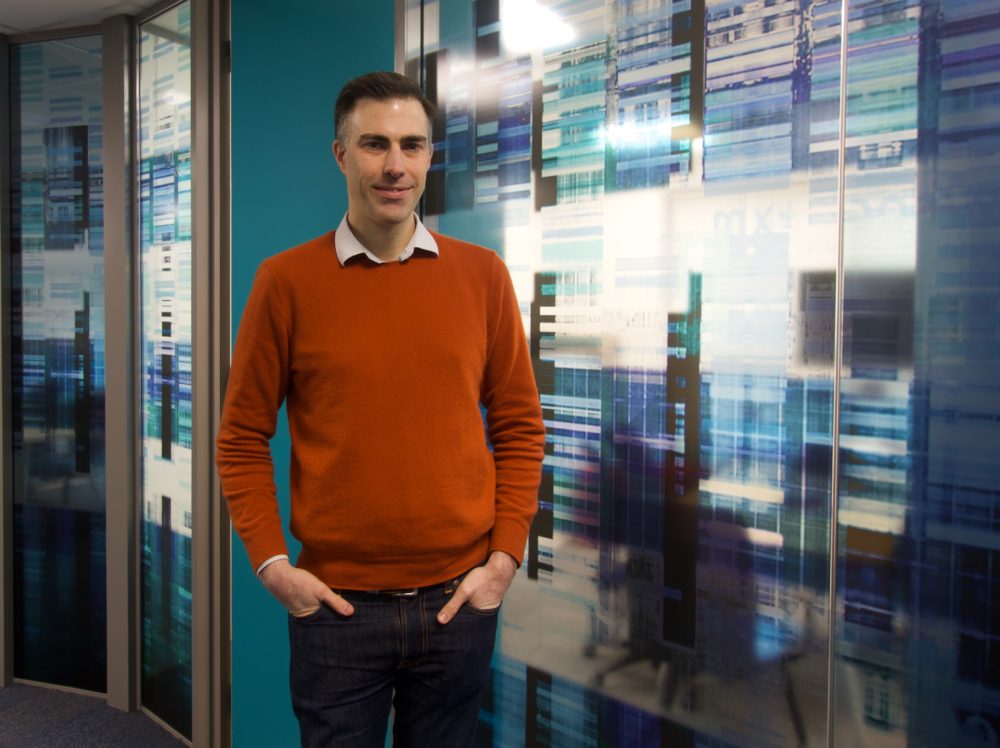
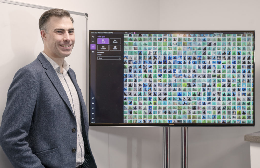
Roger Noble, CTO, Zegami. Pic Karen David
Visualisation engine is making big data analysis a whole lot easier
An Oxford University spin-out has developed software that enables huge volumes of data to be easily accessed and analysed for patterns and anomalies. Software from the four-year-old Zegami is already in use around the world, and has potential to alleviate data analysis issues in any type of big data environment. TechTribe Oxford talks to co-founder and chief technology officer Roger Noble about Zegami’s recent growth, scale-up plans and Twitter activity during the UK general election.
Zegami’s data visualisation engine addresses the challenges organisations face when interpreting big data sets by presenting data as individual images, which can be viewed all at once or at any level of granularity, as required.
It grew out of a project Noble worked on in Australia, which used Microsoft Pivot Viewer. “I saw a lot of potential and limitations, so I started rebuilding it as an open source project,” he says.
His work caught the attention of Steve Taylor at the University of Oxford’s Weatherall Institute, who went on to present the software at an ISIS Innovation (now OUI) bioimaging event. They won funding to develop an MVP (minimum viable product) and successfully pitched to investors for seed round funding. Noble then moved to the UK to work on scaling up the firm.
Agricultural and plant science which requires visual observation of plants is an area where Zegami has gained footholds, and the technology is used in large automated greenhouses in Australia, Germany, the US and Wales.
“With Zegami you can collaborate around a project,” says Noble. “For example, one of the neat things about it is when researchers are posting seeds over to Australia and saying: ‘can you grow these for us?’ They can then remotely monitor experiments in real time wherever they are, which is pretty cool and enables researchers to work in ways that haven’t been possible before.”
The reason for this is the engine’s ability to show thousands of images all at once on a screen, enabling researchers to spot patterns or anomalies.
“We’re unique because we can show five, ten or twenty thousand images all at once. That’s when it becomes really powerful, because you can see patterns rather than have to scrutinise scatter pods to find them,” he says.
In one research project, a dip appeared in growth charts because plants weren’t growing as expected. The images for those plants were completely black. Noble explains: “The greenhouse had suffered a power outage, so the light had failed and the plants weren’t growing.” With Zegami they could clearly see what the problem was, without having to work it out through the research data.
”There are so many ways that things can go wrong it’s hard to automate around that. You can maybe write code to find black images but then something else will happen and your code doesn’t capture. It’s a ‘whack-a-mole’ problem: as soon as you fix one problem another rears its head. With Zegami you can spot these problems a lot faster.”
George Sainsbury, data architect & software engineer the Australian Plant Phenomics Facility at University of Adelaide, has used Zegami for over five years for plant phenotyping, the measurement of plants’ physiological and chemical properties.
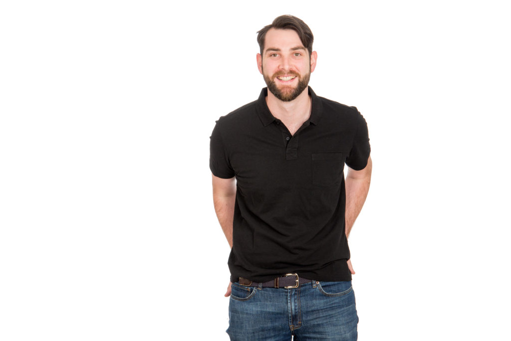
George Sainsbury. Pic supplied
The Plant Accelerator measures physiological traits through automated image acquisition and analysis. “This allows us to compare the effects of changes in genetic material and environmental conditions on the resulting plant. The work is particularly important in solving food supply, one of the grand challenges of modern science,” says Sainsbury.
“Zegami allows us to quickly find corresponding images for anomalous or interesting data points which we use to identify and classify system faults, confirm whether outliers are statistically significant, or we can simply inspect interesting plants.”
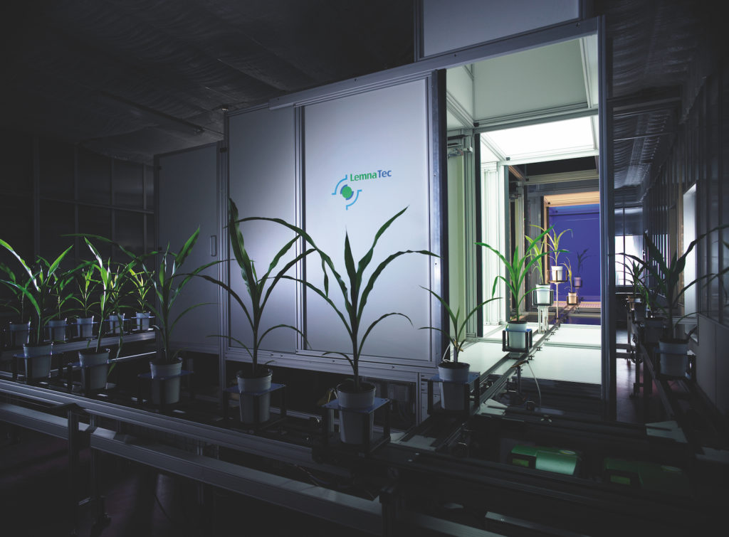
The Plant Accelerator. Pic supplied
In one case the software helped Sainsbury to detect that a measurement which looked like a plant had nearly doubled in size, was actually an RFID (radio-frequency identification) reading error, whereby two plants had been imaged at the same time.
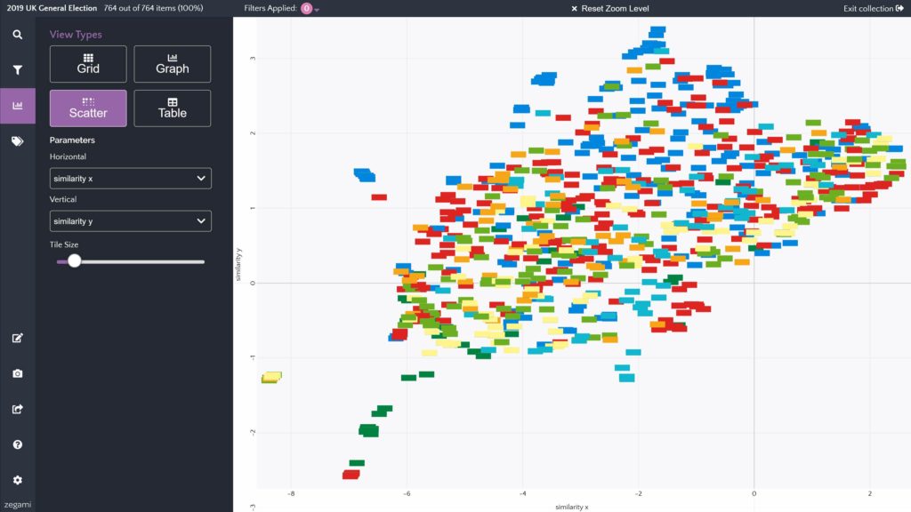
Zegami’s ability to spot patterns or anomalies has wide implications. During the UK 2019 General Election the team put the engine to use to examine the sentiment, style and impact of party leaders’ Twitter posts in the two weeks running up to Election Day on December 12. The software identified characteristics such as whether the tone was positive or negative, which topics they addressed and how content was presented.
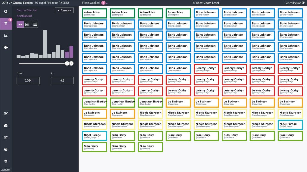
Visualisation of UK party leaders’ Twitter posts, December 2019. Pic: Zegami
“The way Zegami works is we put everything on the screen, you can zoom in or out and select any image to see its metadata. For the leaders’ Tweets, we rendered metadata and Zegami presented each one visually as a Tweet with profile picture, followers, etc, colour-coded by political party. When really small they present as dots, so you can start to see patterns among the different colours.
“You can then use that visual imagery to build a picture. You can apply filters, rearrange by different views and data points. Whatever you are looking for, Zegami lets you see shapes, patterns and outliers,” he adds.
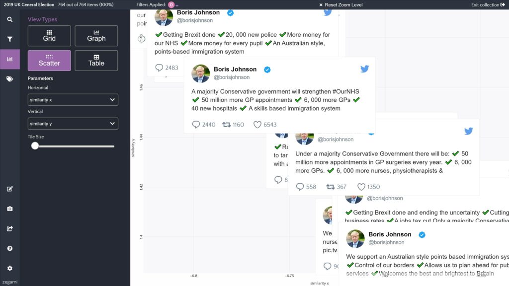
Twitter analysis, UK General Election 2019. Pic: Zegami
Zegami’s abilities to handle and present vast amounts of visual data all at once gave the team some real insights into the leaders’ social media campaigns and the language they used around themes such as Brexit, teachers and defence.
“What was interesting was that Boris Johnson was overwhelmingly positive when you look at the sentiment of his Tweets, and Jeremy Corbyn was probably the most negative,” Noble explains.
Visualisation of Twitter posts, UK General Election 2019. Pic: Zegami
He points out that Zegami is all about presenting data to let you reach your own decisions: “You can put any kind of data – documents, images – into Zegami and have the same controls or way of understanding it visually. It helps you to become more informed.”
Mariana Morris, founder of Oxford-based design studio Fruto, worked with Zegami on the app’s user experience. “Zegami allows users to visualise an incredibly large amount of data, which could be up to 150,000 images,” she says, adding: “The user experience has to be as high quality as the technology behind it, and the interface needs to be simple, usable and engaging to help users explore their data and accomplish their tasks effectively.”
Visualised data as bar charts. Pic: Zegami
Noble and the Zegami team are actively exploring opportunities to take it to new markets. They have used it to perform analyses of Rugby World Cup data since 1987, the total content bank on the Netflix platform and data on the 2019 Edinburgh Fringe.
Simplifying Zegami by launching it as a cloud product gave it a springboard that extended its appeal for non-technicians:
“It enabled us to scale up. Before, Zegami was a desktop application which you had to download and install, but this made it difficult for non-technical people to get used to it. Moving it to the cloud was a way of allowing that on-boarding process to become streamlined.”
One area the team is exploring is HR, where data analysis plays a central role. “HR people have to ask complex questions about data but are not necessarily ‘tech savvy,’” says Noble. “Zegami is a visual way to access data on employees and be informed by it. A key area is retention, so for example Zegami could enable an HR manager to spot employees at risk of leaving by throwing up visual anomalies in the data. This gives them the chance to jump in and do what they need to save those employees.”
Noble sees Zegami being used to complement dashboard-based tools, such as those from Microsoft, to first get an understanding of a data set before building a report. “Dashboard tools are advertised as easy to use, yet you still have to be pretty technical to create a report. Zegami can create a bridge by enabling you to look at your data and get a view over it. Once you have an understanding and can see patterns and shapes within it, you can then refine it and turn it into a dashboard that can be used every day.”
Zegami’s competitive position is hard to define because it’s not like any other data visualisation tool, Noble believes, and he claims not to have a direct competitor. “There are a few smaller apps out there, but nothing that can handle images or data in the way that we do and at the volume that we can.”
This has its challenges, because people need comparisons: “We rely on good demos, which are great at trade shows because we have a big screen and people go ‘Wow! I haven’t seen anything like that!’”
The firm is keen to demonstrate how it can scale up and attract more funding for growth. “This year will be all about focusing on the commercial side. We’re going to need to demonstrate traction, to be in the best place for future rounds as it’s highly likely we’ll need to raise another round within the next year.”
Roger Noble and the Zegami engine. Pic: Zegami
Zegami is also keeping hold of its research roots. “Historically, researchers are budget conscious and if they get a grant it’s time-limited. So we’re looking at ways of going to the institutions themselves with annual licences that can be used across their research teams.
“Our aim is to start to grow some of our proof of concept applications in larger enterprises and build a user base from there.
“I’m really excited by this and looking forward to it. The product’s in the best place it’s ever been and we are showing it to new people outside the Oxford networks. They see it for the first time and are excited about it.
“Ultimately that’s why you do these things, right?”
About the Author

Karen David
Karen has a long career in writing and communications in technology, finance and creative sectors in Oxfordshire, the UK and internationally.Trending in creativetech
Sections
Contact us
Have you got a story? | Has anything on this site
affected you? | Want to write for us? |
Want to advertise? | Want to support us?
© 2024 TechTribe Oxford All rights reserved.
Terms - Privacy Policy
Site by LMNOP Studios